Not many people know how to create good videos. Here are 10 professional video-making tips to help make video an integral part of your marketing strategy.
Before we begin, there is one thing I would like to address. A lot of marketers do not see a positive ROI on videos and leave them out of their content strategy. This happens because they miss out on video creation basics, or choose to ignore them.
If you’re one such marketer, this article is for you. By the time you reach the end, I hope you get inspired to make more videos for your brand or business and consider video as an integral part of your marketing strategy.
Contents
10 Video-Making Tips for Beginners
Learn how to create good videos with these professional video-making tips to help make video an integral part of your marketing strategy.
#1. Remember your goal
It is very easy to sway in the other direction while making a video. Your intention may be to drive more traffic to your blog with a video, but midway you may begin considering brand awareness.
By keeping your goal in mind at all times, you can use every element and every frame of your video to influence the viewer to meet your goal.
As a business or a brand, you can make videos for the following reasons:
- Drive traffic to your blog posts or articles from social media
- Generate qualified leads by running video ads
- Increase brand awareness
- Boost user engagement on social media
- Improve SEO and get more organic traffic to your blog or website and
- Convert users in the sales funnel
How you decide on the goal depends entirely on your content strategy. Content can influence users at every stage of your funnel. And a video is the most impactful form of content you can produce.
Here are 12 types of videos you can make for every stage of your marketing funnel.
#2. Brand your video
Branding should play an important role in your marketing strategy. This is something you cannot measure. You cannot put a number on how many users visited your website, article, or blog by just recollecting your brand through its name or logo.
But branding has a huge impact on your brand. Here are a few brand assets you should have handy if you haven’t done that already:
- Logo – images, animated files, whatever you can get your hands on
- Color palette – get the hex codes of all the colors used by your brand
- Typography – the entire family of fonts used on your website and your blog
Once you have these, make a custom intro and outro for your brand. Include all the above in your intros and outros, and add them to your list of brand assets.
Now that your checklist is complete, make sure you do not deviate from these brand guidelines while making your video.
Most online video editing tools allow you to import all your brand assets so you can include them in your videos. Pssst.. here is a kickass list of video-making tools for social.
#3. Know your platform
If you treat every platform, social network, and forum differently, you’re the content distribution king.
The most common mistake marketers do is having the same distribution strategy for all social media platforms and forums. If you’re one of them, stop. Please STAHP!
Every distribution channel has its own unique set of attributes:
- Length of video,
- Video orientation and format (I’ll talk about this in detail below👇),
- Time to post,
- Title, description, and thumbnail,
- The tone of the video message and music used
Go to your drawing board, make different columns for each channel, and fill in the above attributes for every list.
Look at this board regularly. Get familiar with it. Keep this data at your fingertips. Research and update the board every few weeks.
We use the following channels for our content distribution:
- Youtube
- LinkedIn (we get the highest number of business leads from here)
- Quora
..and yes, I too have a drawing board that I constantly update and look at. In fact, we also use different channels to achieve different business goals. But that is a story for another time. Let’s get back on track.
#4. Choose the right font
Typography is a very important element of your video. Remember to include the font family used by your brand in every video (go back to the brand guidelines discussed above ⬆️).
Develop the knack of knowing which font looks good as a heading, and which font looks best for a paragraph.
A general rule of thumb is to ask yourself, “Can I read what’s written on the screen?”. If your answer is no, change the font.
No matter how extravagant the font is, how slick it looks, or how much the person sitting next to you loves it – the essence of your video will disperse if you use the wrong font.
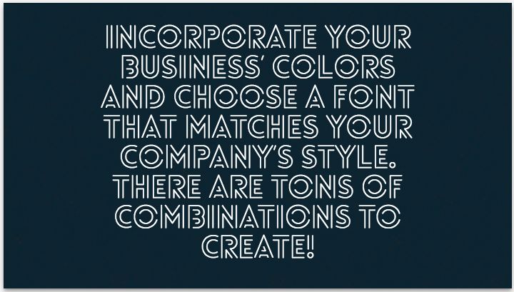
Here is an example of a good-looking font being used incorrectly:
I wouldn’t watch two seconds of this video. NOT TWO SECONDS.
#5. Pick a relevant music track
Remember the first point in this list? Remember your goal. Your choice of music should be driven by this goal.
Imagine you want to raise funds for cancer research and you include the story of a cancer patient in your video. Adding cheerful music to this video as a background is a very ridiculous idea.
Not only will it raise your video abandon rate, but you will not meet your goal. And this is not considering the wrath of your viewers!
But you add an inspirational soundtrack and boom! You’ve suddenly got $50,000 raised for your favorite non-profit.
One more thing before we move on to the next topic, if your video has voice-overs and narration, do not include music with vocals – not unless you want your viewers to be confused for the next 60 seconds.
#7. Select a good color palette
Just like for fonts, develop a knack for selecting a color palette. Understanding the basics of color contrast will improve your video quality a lot!
For example, you cannot have a yellow background with white text on it. I mean, you can, but do you want your viewers to hate you?
Enhance the impact of your message by selecting contrasting colors for text, background, images, and animations – all from your brand’s palette of course.
A very helpful aspect of colors is that they can set the mood of your video, and impact the psychology of the viewer. Red increases passion, intensity, and appetite, yellow depicts cheerfulness and warmth, blue represents serenity and calm, and orange reflects excitement.
I’m personally a big fan of Pixar’s use of colors in their movies. Why? See for yourself.
ROYGBIV: A Pixar Supercut from Rishi Kaneria on Vimeo.
#7. Make videos in the right format
Square, landscape, portrait. There are just 3 video orientations, and yet most video editors get it all wrong.
Let’s roll back a few years to a time when video content was a growing fad on channels like Facebook, Instagram, and Twitter. YouTube was dominating the video scene like a boss.
But all of the videos were landscape (16:9). Which meant you could see black bars when you played the video on your phone.
As Facebook, Instagram, and Twitter raked in more and more mobile users, they realized landscape videos have a very poor experience on the phone.
On the other hand, images in 1:1 ratio looked so great on the mobile apps because they covered most of the real estate of the screen. There was no distraction.
So, they launched square videos. Now the screen had just the video, its description, and the title. This led to an increase in the average video views, engagement, and CTR. The bane of brands and businesses.
Snapchat then took this to another level by allowing brands to make portrait videos (9:16). This was the birth of a fully immersive video experience for mobile devices. And of course, Instagram followed suit.
#8. Run A/B tests for video ads
As a marketer, your every content must follow these steps: create, rinse, repeat.
Experimentation is a huge thing for marketers. If you aren’t experimenting, you will never find the secret recipe for viral content.
Keep aside all your bookmarked articles of “ultimate guides” and “best guides”. Take a look at your audience. Learn from them. Never stop experimenting.
The standard response I get from most marketers when I bring this up is, “Making videos is a task in itself. Now you’re telling me to run experiments by making multiple copies of the same video. Pass.”
When we were building Rocketium, we tackled this with ease. We allow users to clone their videos with a single click, and then let them edit parts of a video to help them experiment. Quick, clean, and effective.
Run A/B tests on the following elements:
- Intro scene
- Thumbnail
- Font
- Color
- Music
- CTA (outro scene)
- Title
- Description
InVideo is one of the best video creation apps for making videos with pictures and music. It simplifies video creation with ready-made templates that you can quickly customize, even if you’ve never done it before.
#9. Add the perfect CTA
Once again, the goal of your video should influence the last scene, the final outro of your video.
If the goal of your video is to drive traffic, insert the CTA “Click on the link below” in the last scene. If it is engagement, “Like, share, and follow” should be your CTA.
Run experiments and arrive at the perfect CTA for each goal. Add it to the drawing board we discussed above.
#10. Don’t forget the thumbnail
The video thumbnail, in my opinion, is the most important, yet the most ignored part of a video.
What most marketers fail to realize is that the thumbnail is your first impression. If you nail this properly, the rest of the viewer’s journey becomes easy.
A thumbnail can make or break your video. Here are 4 tips to make click-worthy video thumbnails:
- Add text and use hashtags
- Make it visually appealing
- Include a human face
- Brand your thumbnails
Now that the 10 tips are done and dusted, I hope this article does not just sit in your bookmarks folder. You need to implement these in your daily routine. Whenever you make videos, these tips should flash into your head.
I’d love to hear what other tips I might have missed that you think beginners should know. Comment away!
More personal branding tips
- Free Social Media Tutorials, Social Media Tools & Schedulers
- How To Create Compelling Social Video Content
- 10 Faceless YouTube Channel Ideas For Introverts
- How to Start Creating an Online Presence for Your Business
- Using Brand Archetypes For Personal Branding With Kaye Putnam
- Effective Personal Branding Tips For Developing A Killer Personal Brand
- Branding For Authors: How To Start Building an Author Platform
- Personal Branding For Coaches: How Do I Market My Coaching Business?
- 4 Hidden Hacks To Skyrocket Your Instagram Stories’ Reach
- How To Be Famous & Get Recognition In Your Industry
Pin & save for later
© 2018 – 2023, Pulkit Jain. All rights reserved.
Discover more from Business & Branding Tips
Subscribe to get the latest posts sent to your email.


